Oi Google, tabular numerals exist
• 1 min read
I opened the Clock app on my Pixel 8 the other day and the design had completely changed. Some things are a bit nicer. Most notably, though, things are bigger and more in your face.
To pick up on something notably worse, this is how the World clock screen now behaves:
Oi Google, should I make a post every time you update an app?
The digits and the things directly below them jump around every second. It looks as though there are two factors contributing to the problem (though the first is the main one):
- not using tabular figures (an OpenType font feature supported by any decent font)
- updating the font size every second to fit a particular width
(The rest of the screen also has problems with spacing and alignment, but I’m not planning on doing Google’s work for them…)
5 September update
And, in the latest Pixel Drop (that has a Material 3 Expressive redesign), Google have done something similar to the lock screen clock:
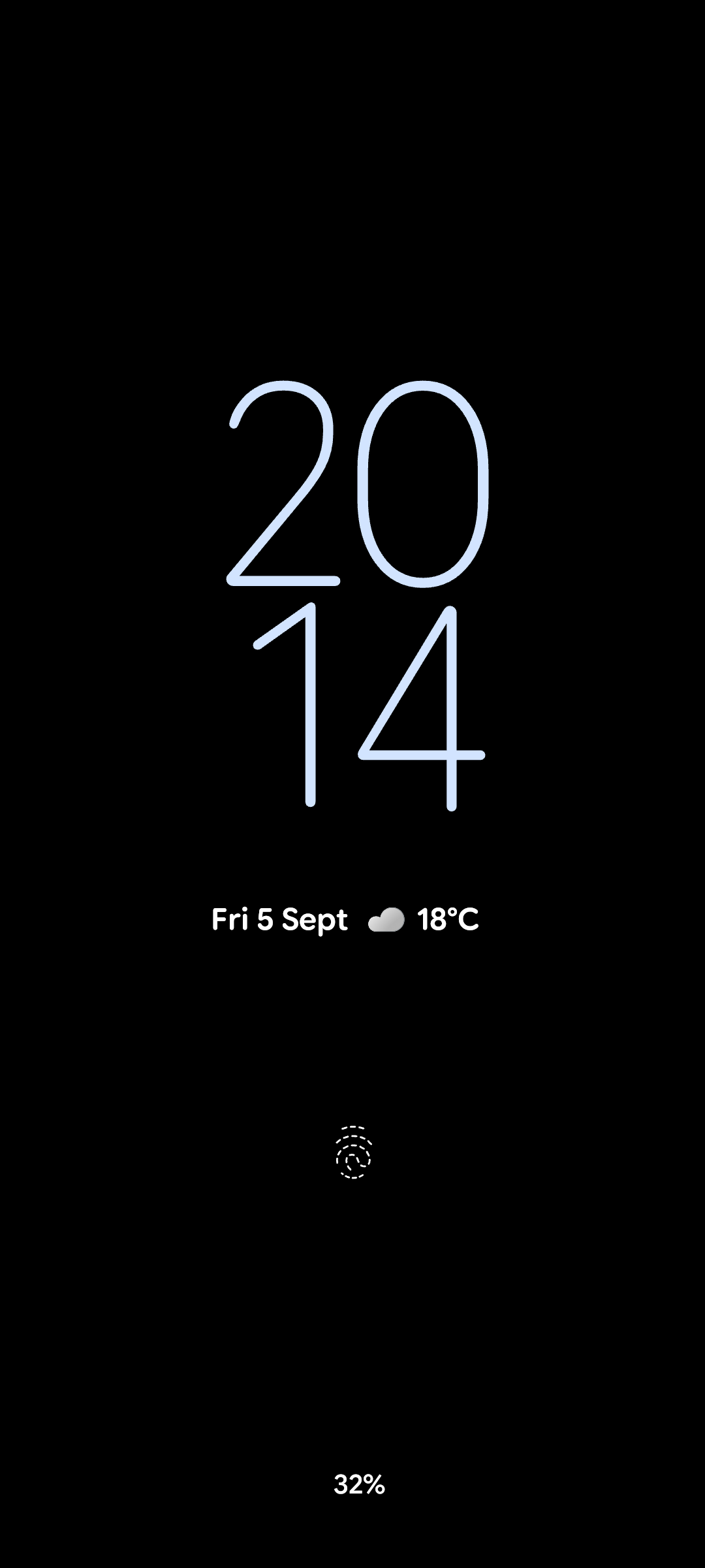
The clock is now unbalanced (the 1 is not centred under the 2), and the two columns move closer and further apart depending on the width of the glyphs in each column.
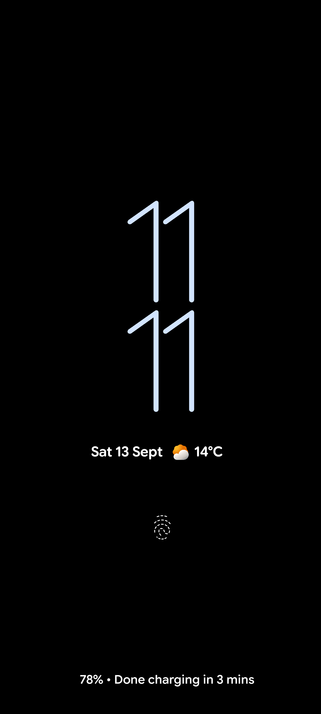
13 September update
And, here’s what 11:11 looks like on the lock screen:
23 September update
My Clock app updated last night and the World clock screen seems to have been fixed.
Buy me a coffee