Oh Google, please test your UI
• 1 min read
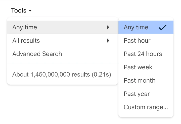
I recently noticed that the ‘Tools’ part of the Google search results page had changed. Previously, clicking the ‘Tools’ button opened a second row of controls. Now, however, it’s now a menu like this:

Unfortunately, the new menu is a bit poor:
The Tools button itself also appears a second after everything else on the page has loaded
The first problem is that, if your mouse pointer temporarily leaves the parent menu item of a submenu, there’s no delay before the submenu is closed or another submenu is opened. It means you have to move the mouse very precisely across to get to the right submenu (while a diagonal motion would be more natural).
The second (and probably worse) problem is that the interactive areas of the submenu items are wrong. When you hover near the bottom of an item, it thinks you’re on the next item.
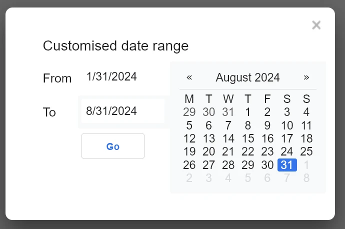
Out of interest, I tried the ‘Custom range…’ time period option:

Here they’ve managed to localise the title, but not the date format (it’s using a US date format, rather than a UK one).
Going back to the menu itself, I was going to say that Google only needs to look at their own web browser for a working implementation of a menu. Alas, I was wrong:
The three-dot (or kebab) menu in Chrome is better, but still bugged
Here, there is a delay before submenus are opened and closed. However, if the first item you reach in the submenu is a disabled item (including separators), it decides to close the submenu anyway.
(Meanwhile, on Android, Google seem incessant on adding ever-longer menu animations, while breaking longstanding behaviours like long-tapping on the three-dots button in Chrome to refresh the page.)
Buy me a coffee