What does each step in the ClearType Text Tuner do?
• 9 min read
There’s a utility named ClearType Text Tuner that comes with Windows. It can be
found by searching for ‘Adjust ClearType Text’ in the Start Menu or the Settings
app, or by running cttune.exe directly.
The utility takes you through a series of steps that adjust how text is rendered. Most of the steps ask you to select the text sample that looks the best from a selection. The process seems well-intentioned. However, I always found it difficult to pick between the different text samples. For the most part, the text just looks different – it’s not easy to decide which one looks the best. And the utility never tells you what to look for or what exactly you are adjusting on each page.
As I’ve been using the DirectWrite API recently, I became more interested in what settings the tuner was adjusting (partly to understand how they affect my software, and to check if my software is doing the right thing).
I found some useful information about some of the settings in the Windows Presentation Foundation (WPF) documentation. And the DirectWrite API documentation has some information about the various parameters. But there was little information online about what each step in the ClearType Text Tuner is changing.1 So, I set about working it out myself, and here’s what I documented.
(If you’re unfamiliar with ClearType in general, the ClearType article on Wikipedia has some background information.)
The steps
1. Make the text on your screen easier to read
The first step contains a single option – ‘Turn on ClearType’:
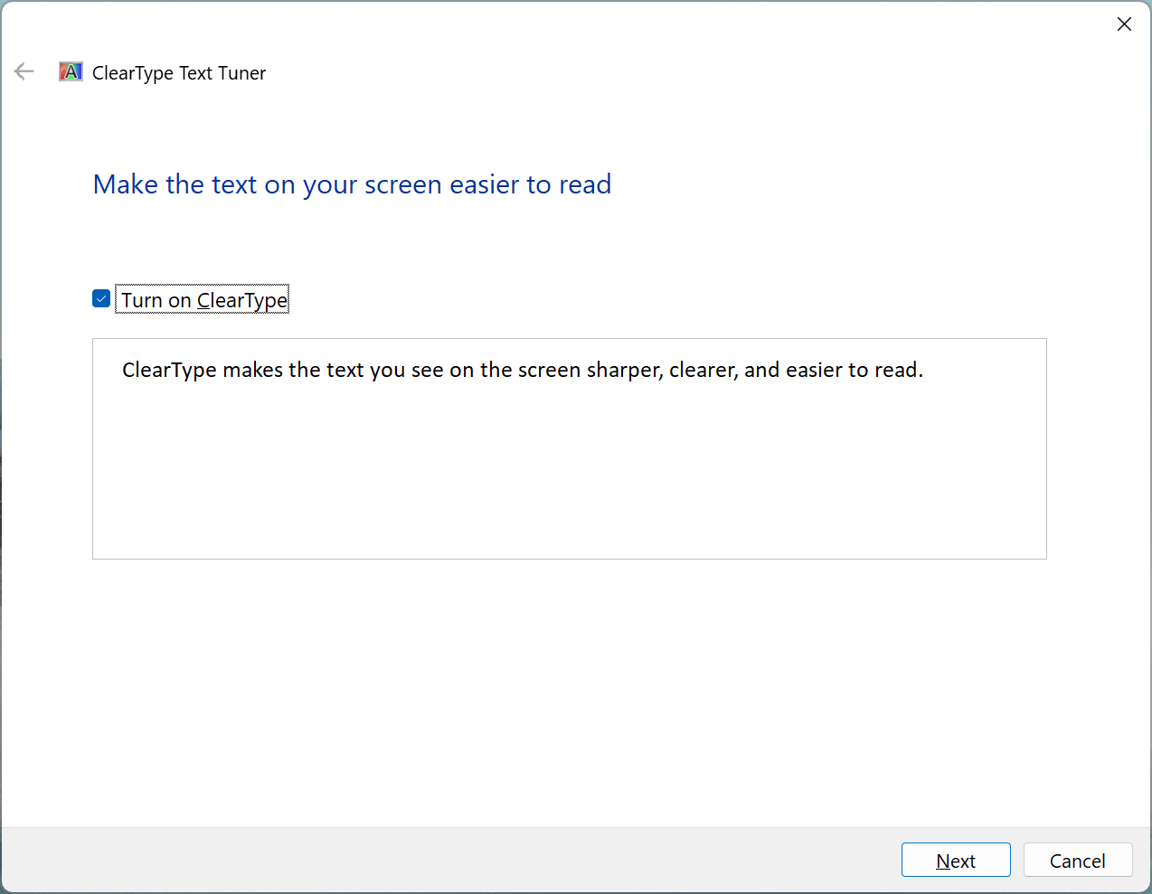
That sounds fairly self-explanatory. I’d point out, though, that turning off ClearType doesn’t turn off text anti-aliasing completely. There’s another (somewhat buried) setting named ‘Smooth edges of screen fonts’ that’s meant to control that. (You can get to that setting by searching for and selecting ‘View advanced system settings’ in the Start Menu and clicking on the ‘Settings…’ button under Performance.)
‘Turn on ClearType’ changes the registry value FontSmoothingType under the key
HKEY_CURRENT_USER\Control Panel\Desktop. If ClearType is on, the value is set
to 2, and if it’s off, the value is set to 1.
(The other ‘Smooth edges of screen fonts’ setting changes the FontSmoothing
value – 2 means on, and 0 means off.2)
2. Do you want to tune all monitors now?
Some settings the tuner sets are per monitor. So, if your desktop extends over multiple displays, you’ll be asked to select which ones you want to adjust settings for:
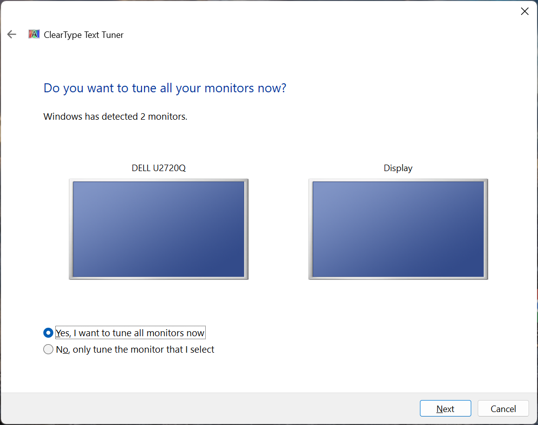
If you only have a single display (or e.g. cloned displays), this step will be skipped.
(If you are tuning ClearType for multiple displays, I’d do them one at a time, as the ClearType Text Tuner does not support per-monitor display scaling.)
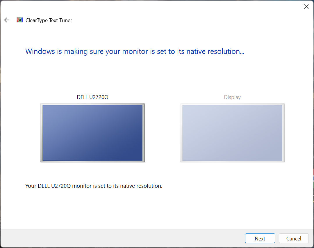
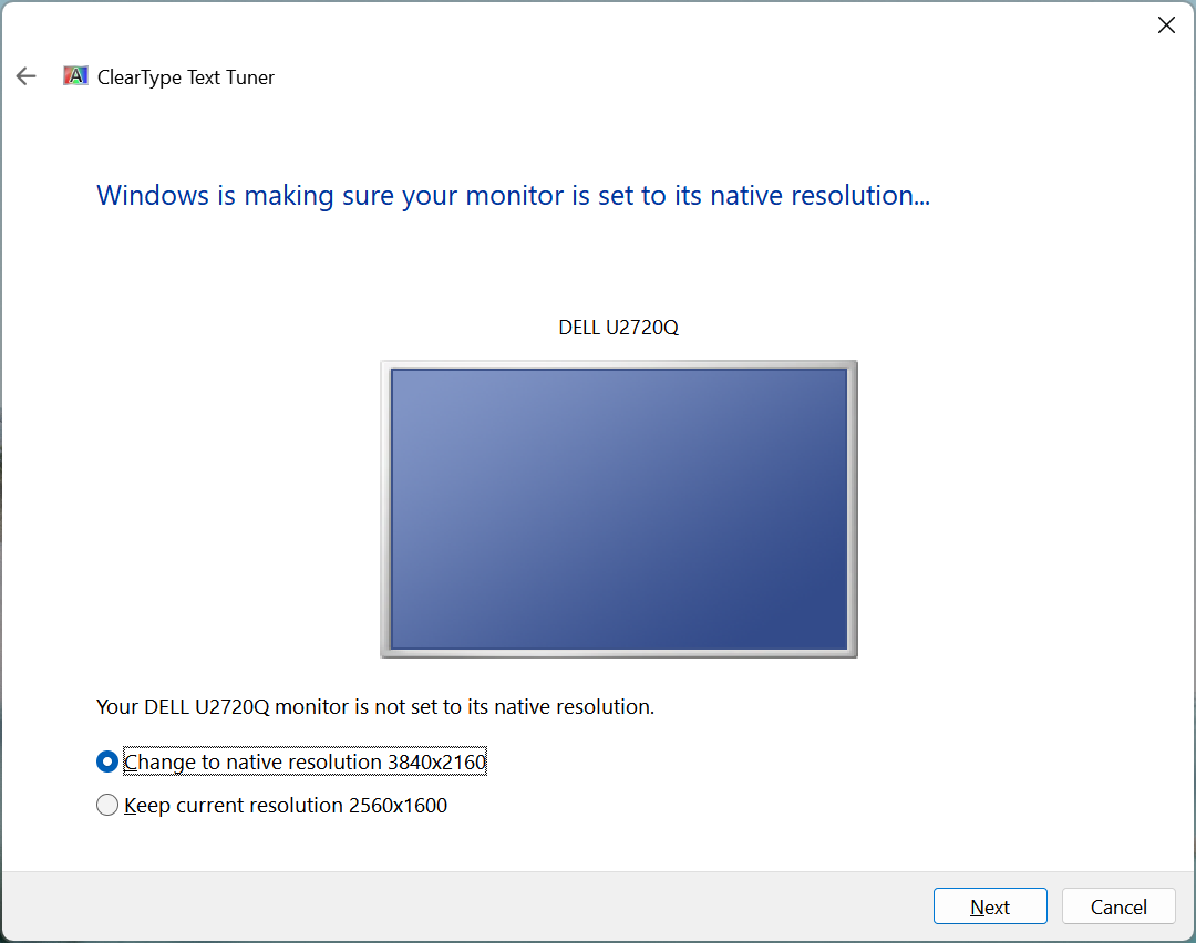
3. Windows is making sure your monitor is set to its native resolution…
If your monitor is set to its native resolution, you’ll see this:
If for some reason your monitor is not set to its native resolution, the tuner will instead offer to change that:
4. Click the text sample that looks the best to you (1 of 5)
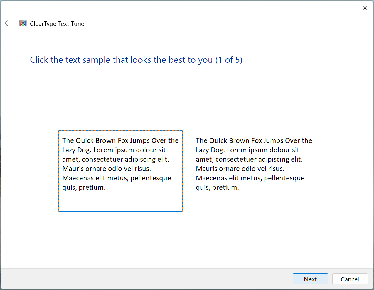
In this step, you’re selecting the subpixel layout of your display. The option on the left is for RGB, while the option on the right is BGR.
The pixel density of my monitor is too high for me to tell the difference with the naked eye. However, the difference is visible with some macro photos.
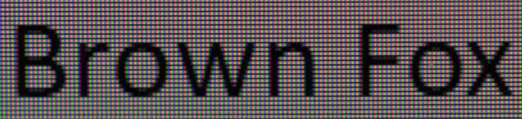
Here’s a close-up of the text in the first option (RGB):
And here’s a close-up of the text in the second option (BGR):
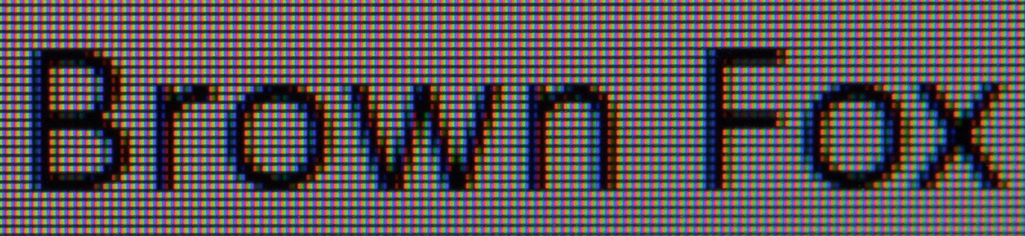
You may be able to see that the subpixels of my monitor are ordered red, green and then blue, and that in the BGR photo there is colour down the middle of the stem of the letter r.
This step sets three registry values. The first is FontSmoothingOrientation
under HKEY_CURRENT_USER\Control Panel\Desktop. For this one, 1 means RGB,
and 0 means BGR.
The second value is a per-display value. It’s named PixelStructure and is
under the HKEY_CURRENT_USER\Software\Microsoft\Avalon.Graphics\<display name>
key (where <display name> is a value like DISPLAY1, corresponding to the
display being tuned). The third value is the same as the second one, but under
HKEY_LOCAL_MACHINE instead. For these values, 1 means RGB and 2 means BGR.
And although it wasn’t an option in the tuner, PixelStructure can also be set
to 0 (meaning ‘flat’, and causing greyscale anti-aliasing to be used).
5. Click the text sample that looks the best to you (2 of 5)
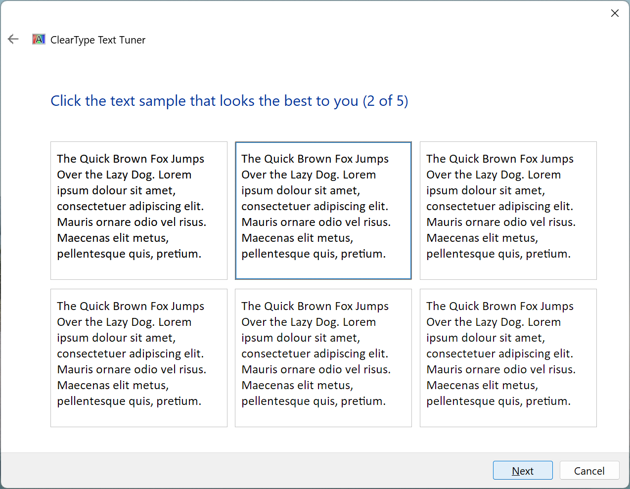
This step sets the FontSmoothingGamma registry value under the
HKEY_CURRENT_USER\Control Panel\Desktop key.
The ClearType Text Tuner has seven options – 1000, 1200, 1400, 1600,
1800, 2000 and 2200. However, you only see six of the seven options – the
first or last is omitted, depending on the current value of the setting.
Now, while the name of that registry value has ‘Gamma’ in it, in the Win32 API the same parameter is called contrast. Here’s what the Windows GDI documentation says about it:
You can adjust the appearance of text by changing the contrast value used in the ClearType algorithm. The default is 1,400, but it can be any value from 1,000 to 2,200. Depending on the display device and the user’s sensitivity to colors, a higher or lower contrast value may improve readability.
(Despite what that quote says, the tuner seems to treat 1200 as the default.)
If you have multiple displays, this step only appears when tuning the primary display. (For non-primary displays, this step is skipped and all the ‘Click the text sample that looks the best to you’ steps are renumbered.)
6. Click the text sample that looks the best to you (3 of 5)
For the remainder of the steps, the tuner does not preselect the currently configured values – it instead always defaults to the same options.
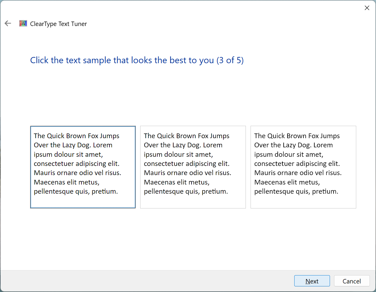
This step sets the ClearTypeLevel value under
HKEY_CURRENT_USER\Software\Microsoft\Avalon.Graphics\<display name> to 100,
50, or 0. (This and the remaining steps do not set anything under
HKEY_LOCAL_MACHINE.)
The WPF documentation says (specifically about the registry value):
The ClearType level allows you to adjust the rendering of text based on the color sensitivity and perception of an individual. For some individuals, the rendering of text that uses ClearType at its highest level does not produce the best reading experience.
The ClearType level is an integer value that ranges from 0 to 100. The default level is 100, which means ClearType uses the maximum capability of the color stripe elements of the display device. However, a ClearType level of 0 renders text as gray scale. By setting the ClearType level somewhere between 0 and 100, you can create an intermediate level that is suitable to an individual’s color sensitivity.
And the DirectWrite documentation says:
The ClearType level represents the amount of ClearType – that is, the degree to which the red, green, and blue subpixels of each pixel are treated differently.
(Note that DirectWrite divides the registry value by 100, so 50 becomes 0.5, for example.)
7. Click the text sample that looks the best to you (4 of 5)
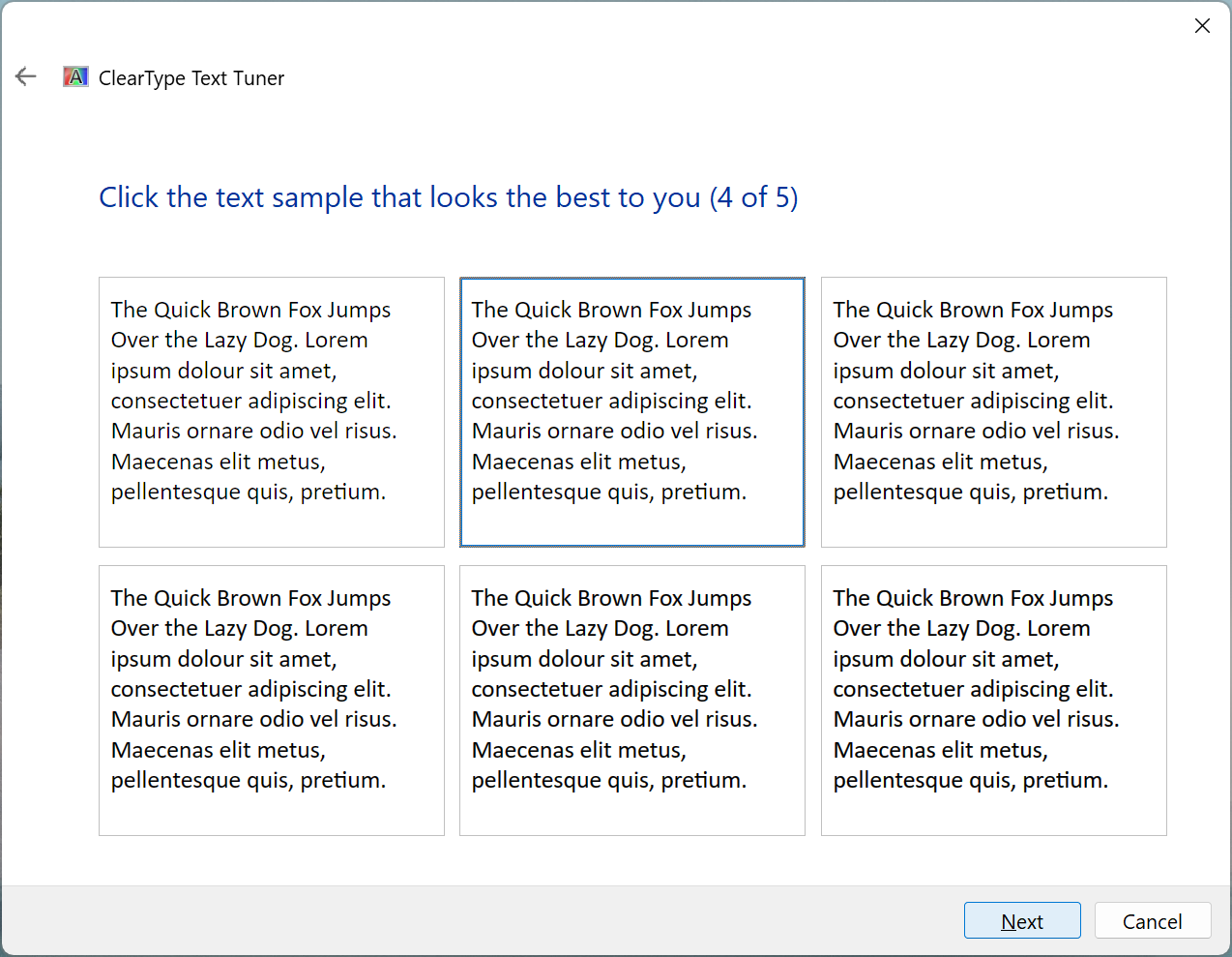
This setting sets two registry values under
HKEY_CURRENT_USER\Software\Microsoft\Avalon.Graphics\<display name>.
The first one is EnhancedContrastLevel.
The DirectWrite documentation says,
‘Enhanced contrast is the amount to increase the darkness of text’. As far as
I’ve observed, it’s mainly relevant for dark text on a light background (and it
has little or no effect on white text on a black background). The six options
set the value to 0, 50, 100, 200, 300 and 400 respectively.
(DirectWrite again divides the registry value by 100 here.)
The second value set is TextContrastLevel. The
WPF documentation says
that the ‘text contrast level allows you to adjust the rendering of text based
on the stem widths of glyphs’. The six options set this value to 0, 0, 1,
1, 1 and 2 respectively. (However, the WPF documentation says that the
range is 0 to 6.)
8. Click the text sample that looks the best to you (5 of 5)
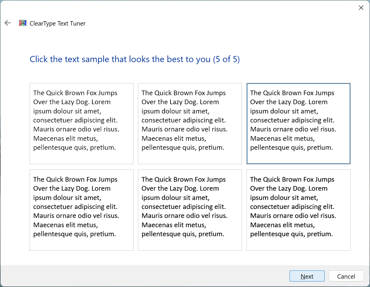
This setting sets the GrayscaleEnhancedContrastLevel registry value under
HKEY_CURRENT_USER\Software\Microsoft\Avalon.Graphics\<display name>.
This is a contrast enhancement setting specifically for greyscale antialiasing. (And the DirectWrite documentation does not say anything else about it.)
The six options set the value to 0, 50, 100, 200, 300 and 400
respectively.
9. You have finished tuning the text on this monitor
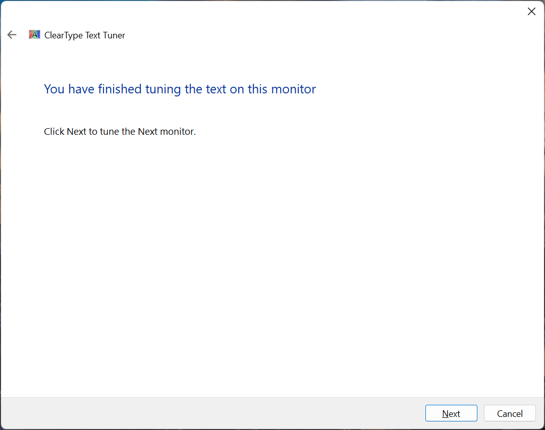
If you selected the option to tune multiple displays, you’ll be shown this step.
The tuner will then go through the previous steps for the additional display
starting from the native resolution check (and skipping the step that sets
FontSmoothingGamma).
10. You have finished tuning the text on your monitor(s)
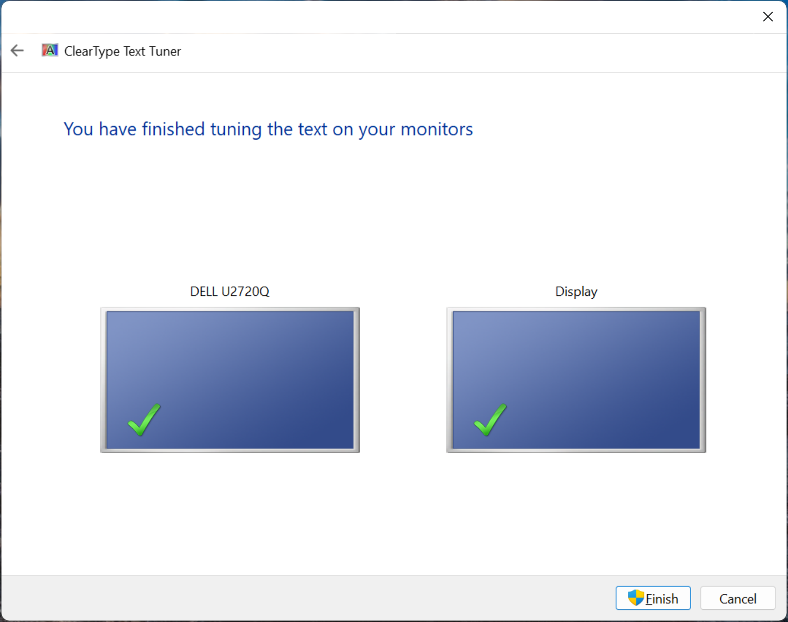
After all monitors have been tuned, you’ll be shown this final step. Only when ‘Finish’ is clicked are the changes committed to the registry.
The tuner sets another registry value
The tuner also sets the per-monitor GammaLevel values under
HKEY_CURRENT_USER\Software\Microsoft\Avalon.Graphics\<display name> and
HKEY_LOCAL_MACHINE\Software\Microsoft\Avalon.Graphics\<display name>. It seems
to automatically work out the number to use from the environment and display
properties. (For my desktop, it sets the per-monitor gamma value to 2200,
meaning 2.2, while in a virtual machine it set it to 1800.)
Regarding gamma, the Windows Presentation Foundation documentation says:
The gamma level refers to the nonlinear relationship between a pixel value and luminance. The gamma level setting should correspond to the physical characteristics of the display device; otherwise, distortions in rendered output may occur. For example, text may appear too wide or too narrow, or color fringes may appear on the edges of vertical stems of glyphs.
And the DirectWrite documentation says:
The gamma value is used for gamma correction, which compensates for the non-linear luminosity response of most monitors.
(Note that if the registry value doesn’t exist, DirectWrite seems to use 1.8. So, if the value is not currently set, it can be worth going through the tuner once just to set it.)
Other things to note
All the above is what I’ve observed while experimenting with the tuner. It’s possible that it can do other things in scenarios that I haven’t encountered. And older or newer versions of the tuner may behave differently (I primarily tested on Windows 11 24H2).
Another point to note is that different applications, and even different parts
of the same application (such as in File Explorer), will be affected by
different settings. It depends on the text rendering API the application uses
and how the application uses that API. As far as I know, the
FontSmoothingGamma value under HKEY_CURRENT_USER\Control Panel\Desktop will
only affect applications using GDI to render text. And all the values under
Avalon.Graphics are primarily relevant for applications using DirectWrite or
WPF. (And some applications using DirectWrite may not support the per-monitor
parameters correctly and just use the values for the primary display.)
There are also limited notifications when the ClearType Text Tuner changes settings, so you may need to close and reopen some apps after clicking the final ‘Finish’ button to see the effect. (In the case of File Explorer, you’ll probably need to restart the process using Task Manager.)
Lastly, Microsoft recommends greyscale anti-aliasing for their newer app technologies, so you’ll see newer functionality in Windows using greyscale anti-aliasing rather than ClearType (confusingly, though, there are still relevant settings set by the ClearType Text Tuner).
Footnotes
-
There was a promising StackExchange question. Alas, it was closed as a duplicate of a fairly unrelated question (which doesn’t even contain a question). ↩
-
No, I don’t know what a value of
1means here. ↩