Emojis in Windows 11: A mess once you look closely
• 3 min read
Take the sequence of ❤❤︎❤️. This is U+2764 (HEAVY BLACK HEART) in default, explicit text (monochrome) presentation and explicit emoji (colourful) presentation.
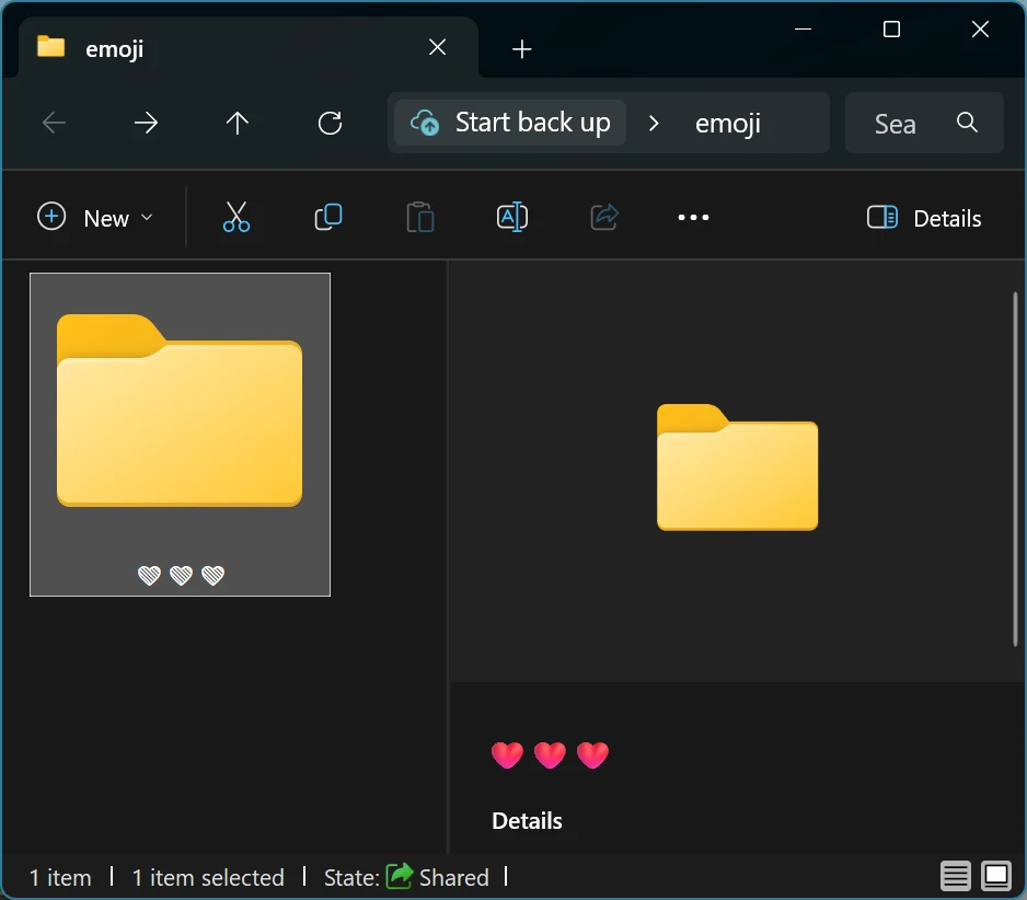
Here’s how that sequence of emojis renders in two different places in File Explorer:

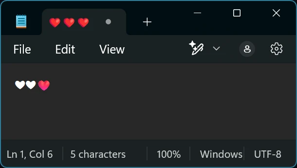
Here’s how it renders in Notepad (in a tab and in the main typing area):

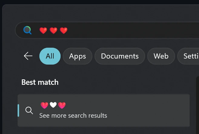
And here’s how it renders in the Start Menu search box and search results:

That’s no less than five different renderings of the same sequence of emojis.
The basic reason for the differences is relatively simple: there’s a mix of technologies at play, including Win32, GDI, Uniscribe, DirectWrite, Direct2D, RichEditD2D controls and WebView controls.
The first relevant difference between those technologies is that they support different sets of glyph formats (such as normal monochrome glyphs, COLR glyphs and SVG glyphs), causing different glyphs for U+2764 from the Segoe UI Emoji font to be used.
Support for emoji variation selectors also affects how the second and third hearts render. Some emojis (such as ❤) have both text (monochrome) and emoji forms under the same code point. The two forms can be explicitly selected between by following the emoji code point by a variation selector (U+FE0E for the text form, and U+FE0F for the emoji form). However, most of the technologies previously mentioned don’t support emoji variation selectors, causing all three hearts to render identically. WebViews and seemingly RichEditD2DPT controls do support emoji variation selectors and hence render the two different forms of the emoji in question.
Also note that when variation selectors are supported, the typical approach is to use Segoe UI Symbol for text presentation and Segoe UI Emoji for emoji presentation. This results in the text and emoji forms looking inconsistent (as the emojis in the two fonts do not have the same design). This inconsistent appearance also happens on Android, so perhaps isn’t that unexpected. It is, however, annoying, as Segoe UI Emoji has monochrome glyphs that are similar in design to the colour glyphs but are generally inaccessible in applications unless colour glyphs are disabled completely.
Lastly, those technologies don’t all agree on what the default presentation of ❤ is. According to the Unicode standard, ❤ has a text (monochrome) presentation by default (though the standard allows varying default presentation modes depending on the purpose of the application e.g. suggesting chat apps could default to emoji presentation). Notepad sticks with a default text presentation, while DirectWrite itself uses a default emoji presentation for that emoji for some reason.
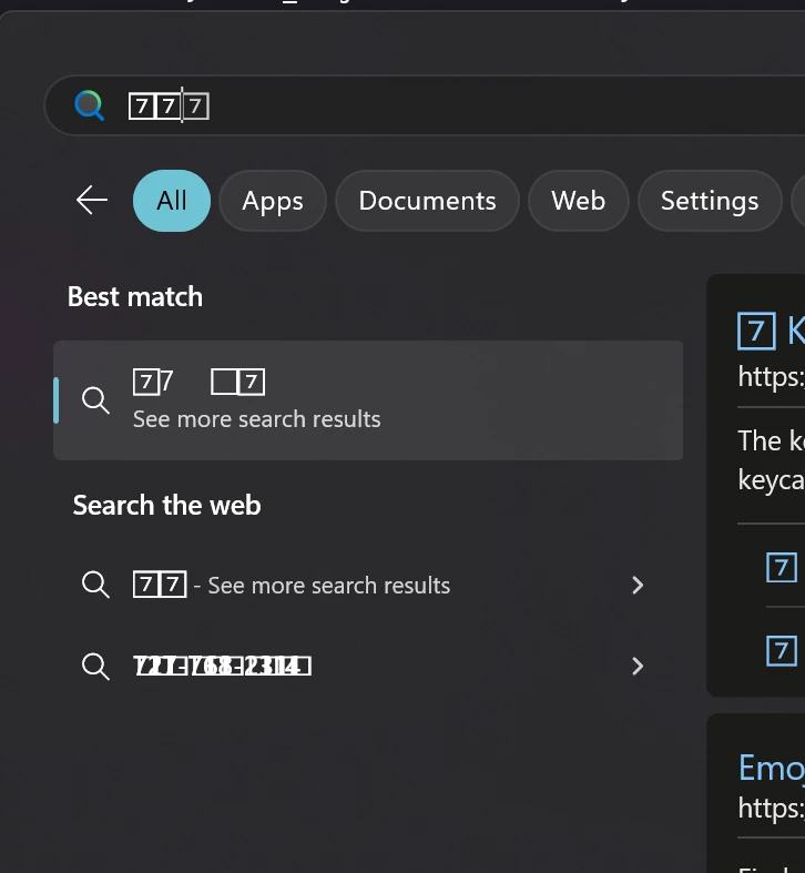
There are other weird things that happen with some emoji sequences. Take this Start Menu search for 7️⃣7️⃣, for example:

As a user, this all just looks like a mess. As a developer, it’s frustrating that DirectWrite does not support variation selectors out of the box, and that the subject is not touched on in the documentation for DirectWrite.
And, why do Direct2D-rendered SVG glyphs tend to have horrible jagged edges? Firefox does a much better job, for example.
Buy me a coffee