Civilization VII: It needs some love
• 3 min read
I liked Civilization V. And I liked Civilization VI. And so I was looking forward to Civilization VII enough to pre-order it, and play it a few days ahead of general release.
Alas, that decision to pre-order it was probably a mistake. Like many others, my main problem with the game is the unpolished and unfinished UI.
My first, and largest annoyance, is the lack of control over UI scaling. The choice you’re given is to scale the UI, or to not scale the UI. At a 4k resolution, you’re picking between everything being massive:
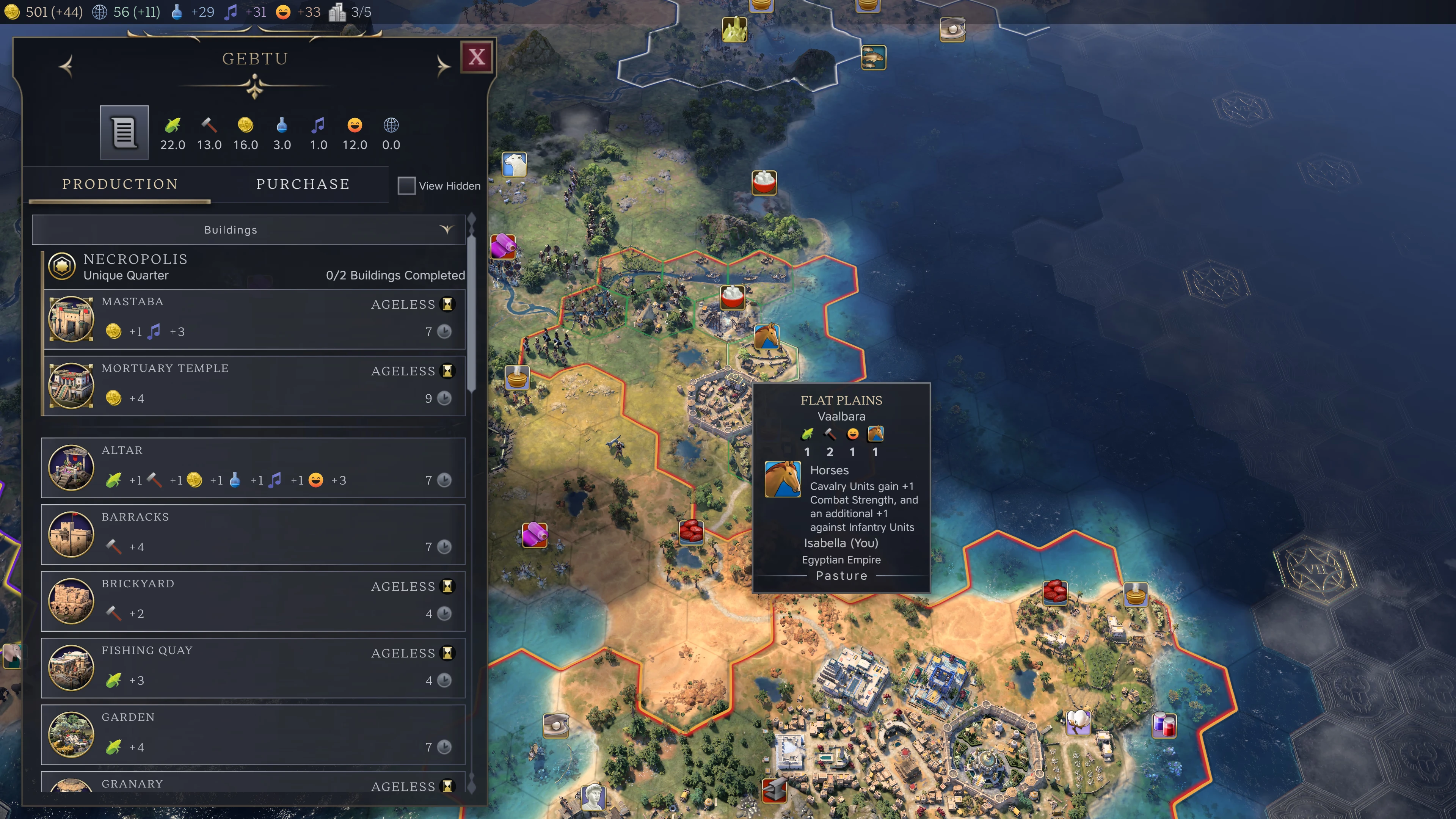
…or being tiny:
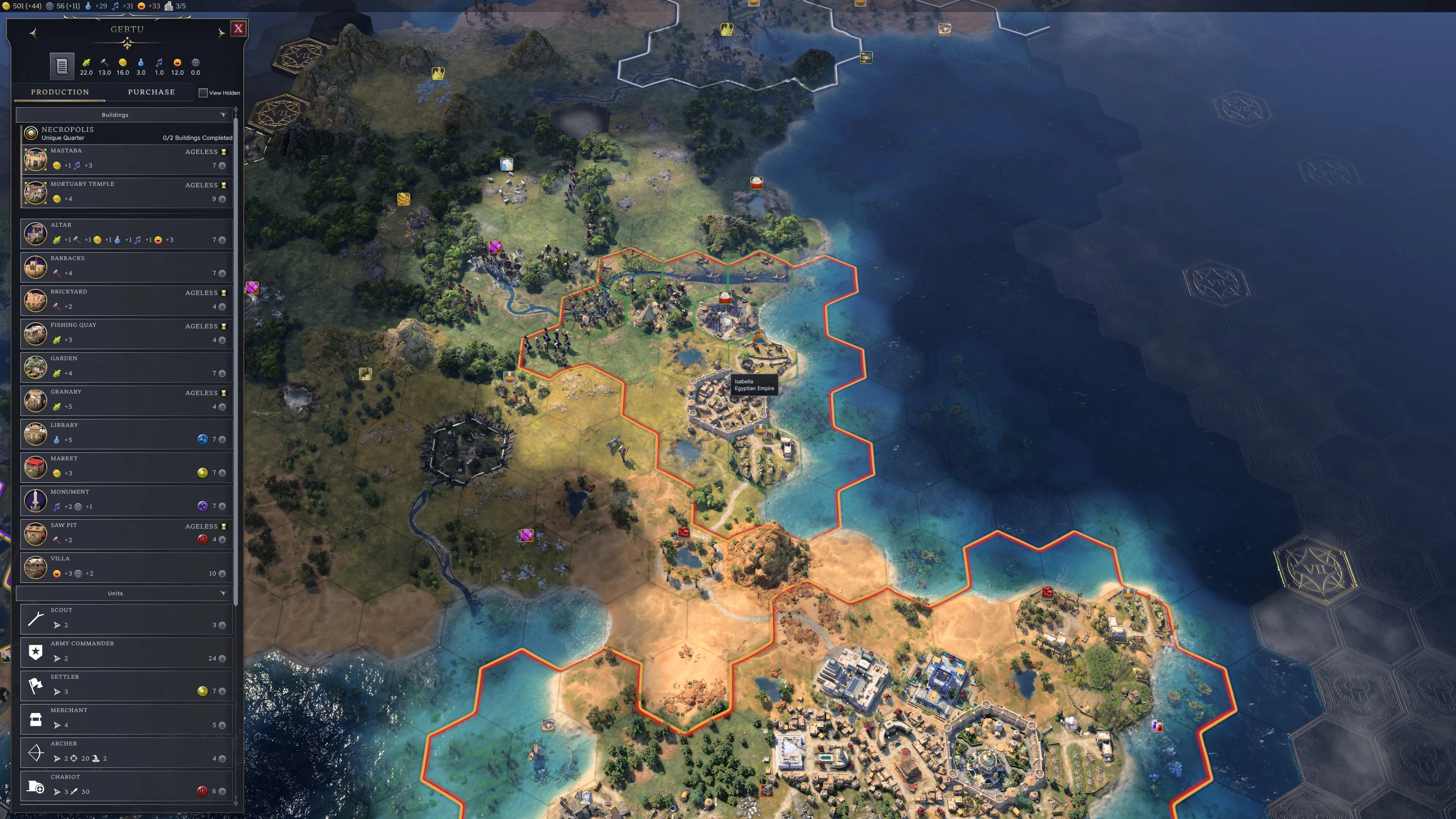
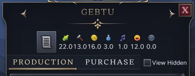
Maybe the font scale setting will help? Nope! With UI scaling on and font scale on extra small, everything is still too big (just with more empty space). And with UI scaling off and font scale on extra large, all the controls are still too small, while the text starts to have problems in places due to fixed positioning:
Scaling, though, isn’t the only UI problem. My next annoyance is that something about the text style and rendering often makes it horrible to read. Take the screen that shows when you start or resume a game:
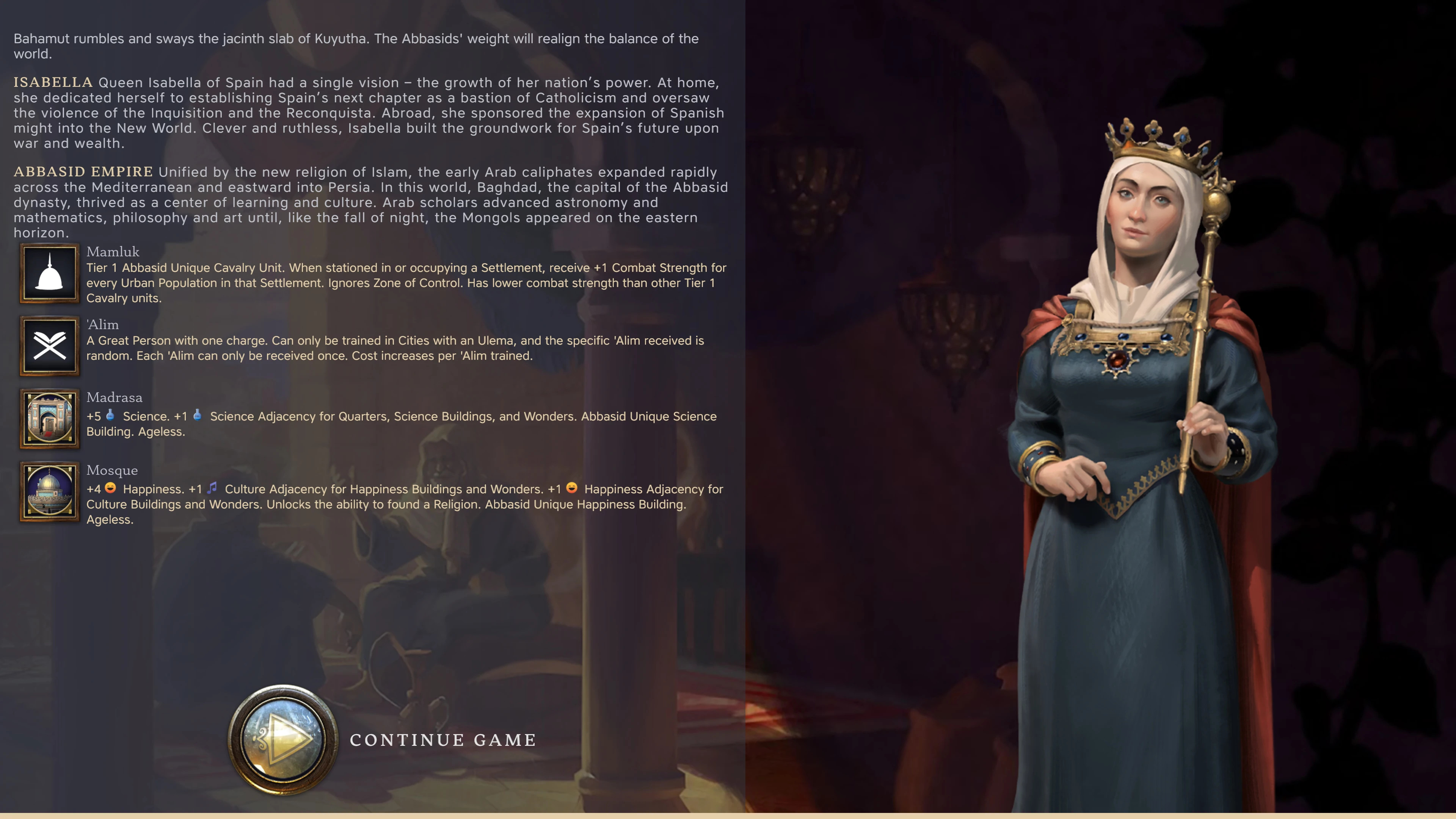
For some reason1, someone’s fiddled with the character spacing of the second and third paragraphs, while managing to leave the first paragraph alone. Compare the ‘the’ from the first and second paragraphs, for example:

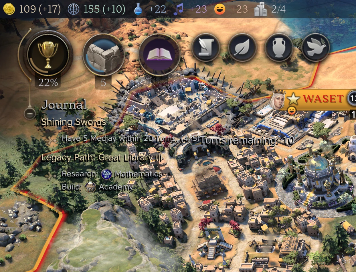
The journal text, meanwhile, sometimes clashes with the map:
And there are frequent text alignment, positioning and spacing problems. Here’s a screenshot of the pantheon selection screen with various problems highlighted:
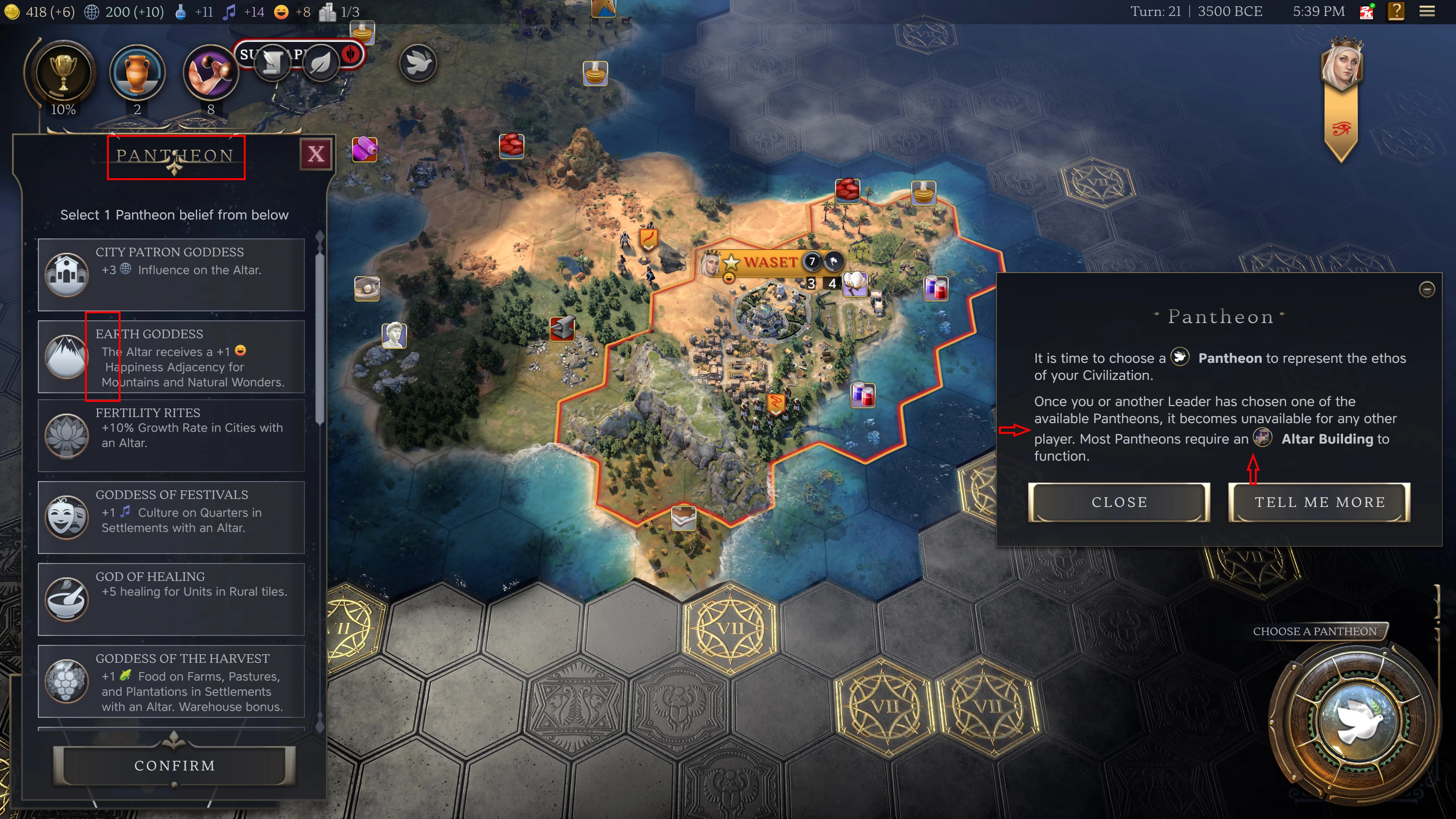
In that one screenshot, you have graphics overlapping text, dodgy word wrapping, an icon messing up line spacing, and some uneven spacing around that same icon.
And, here’s a video of me scrolling a list and the map at the same time with the mouse wheel:
So far, the actual game mechanics seen decent. But this is still spoiled by poorly thought-out interactions. It took me a while to work out how to make friends with an independent power, because I wasn’t clicking where it wanted me to (clicking on the hex title itself brings up the relevant screen, but clicking on the floating name banner above the tile was doing nothing at the time).
Another example is the game yelling ‘SETTLEMENT IS IN UNREST!’ Okay, but what can I do about it? Maybe the Civilopedia will tell me? Nope, there’s no entry for unrest.
And there was this odd and pointless bit of dialogue I got after negotiating peace with Xerxes:
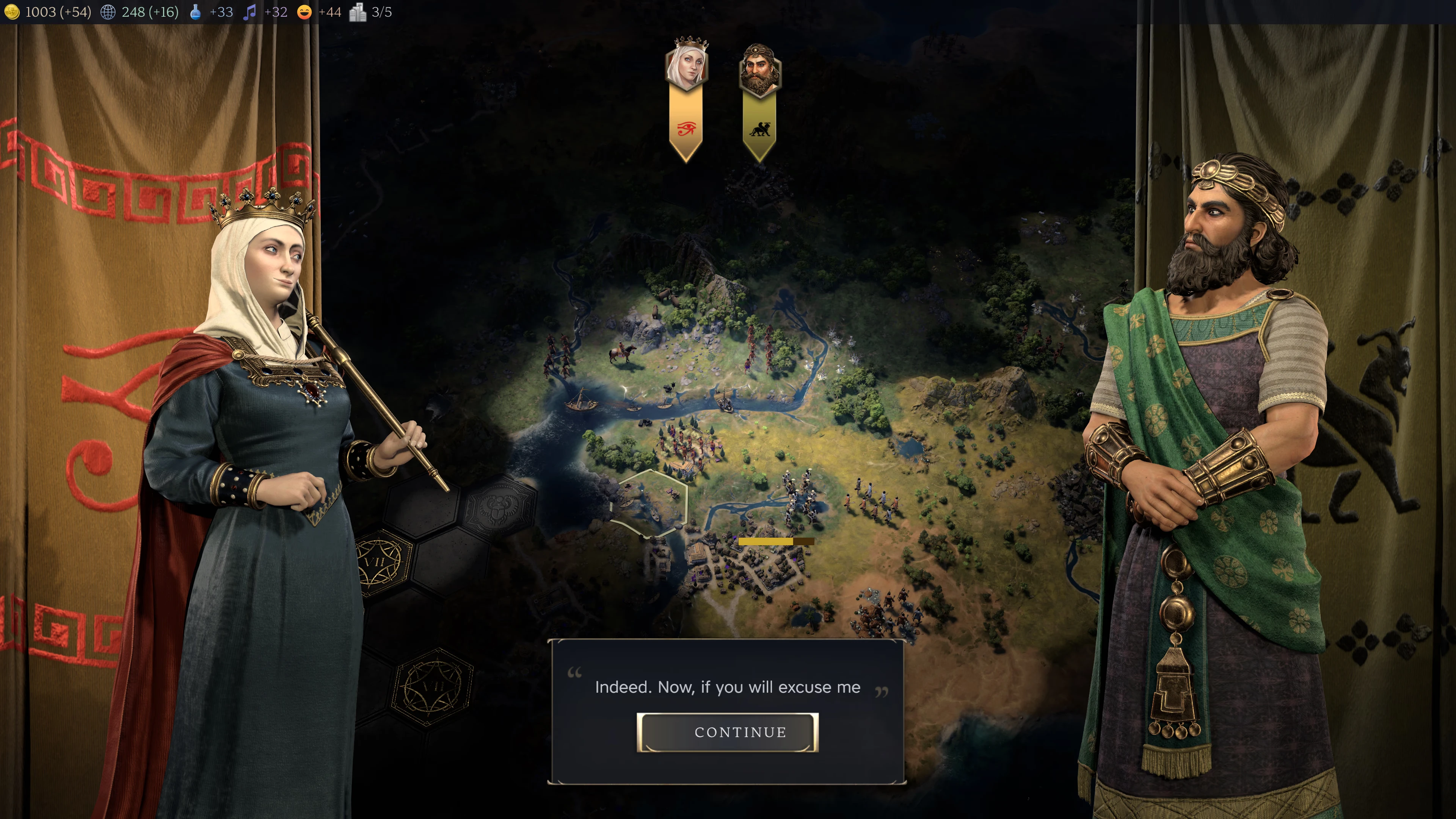
I hope the game improves over time. But it’s not worth the up to £120 asking price in its current state, and I doubt I’ll be playing it much until it’s had some needed polish.
Footnotes
-
I assume it’s related to the headings in capitals at the start of the second and third paragraphs. Alas, that wasn’t really the point. ↩